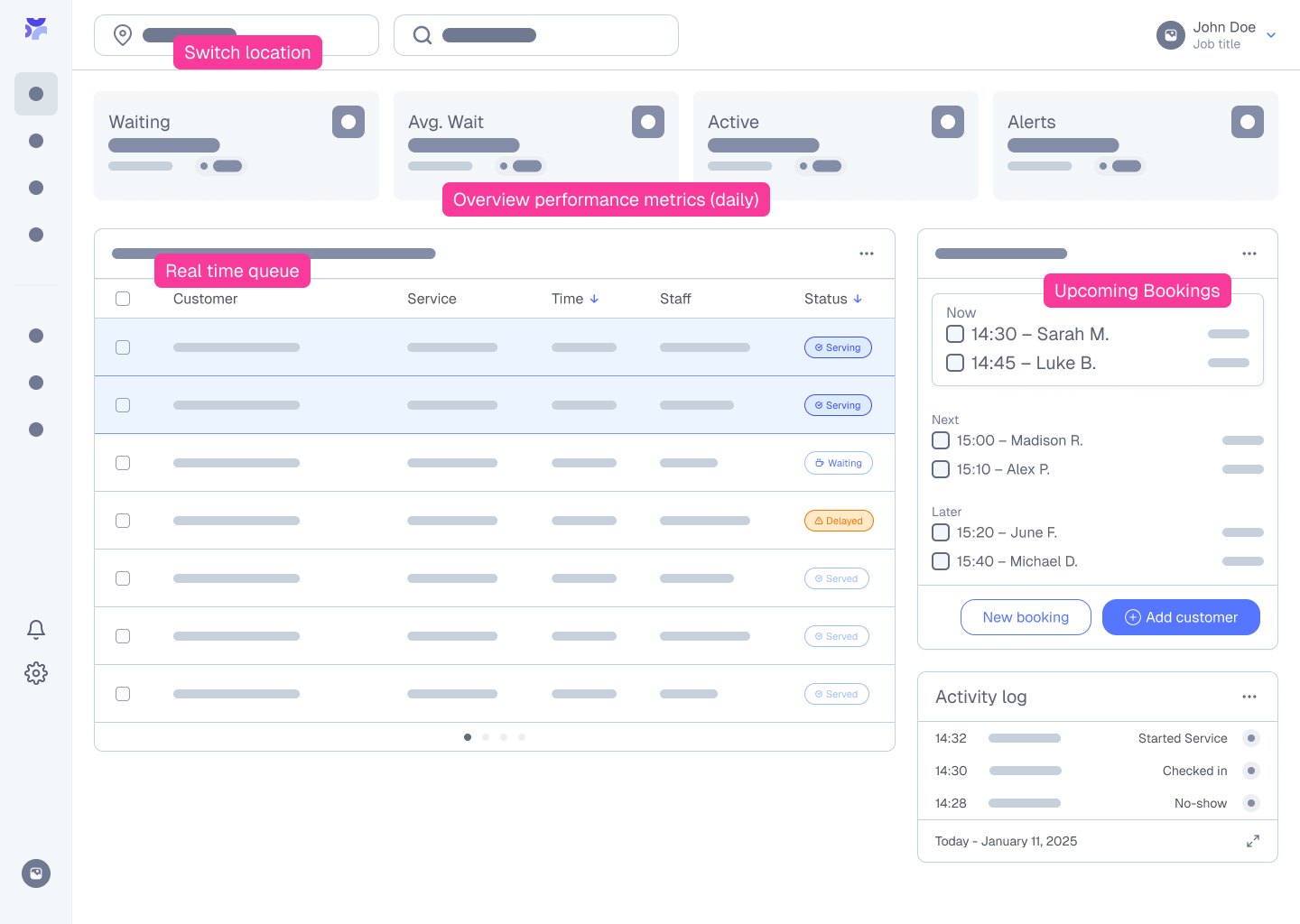
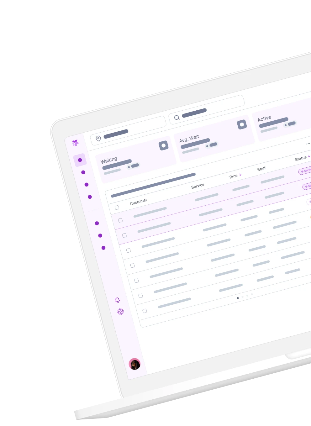
Linea is a self-initiated product design exploration for managing queues, bookings, and multi-location operations.
This project focuses on building a scalable UI system to support complex operational workflows.
Why a design system
Fragmented tools and inconsistent workflows create inefficiencies across operations.
Approach
Focused on defining scalable foundations and reusable UI patterns before expanding into product flows.
User Personas
Linea is designed for teams managing customer flow across multiple locations. These personas represent key users, from front desk staff to operations managers and business owners, highlighting their needs to guide a system that is efficient, scalable, and easy to use.
Mark Goldman
Primary User
Role:
Operations Manager
Age:
35-45
Company:
Mid-size service business (e.g. clinics, salons, service centers)
I need a clear view of what’s happening across all locations, but I’m constantly jumping between tools and struggling to keep operations consistent.
Key interaction with Linea: Monitors queues and adjusts staffing
Goals
Oversee operations across multiple locations
Reduce wait times and improve efficiency
Ensure consistent workflows across teams
Frustrations
No centralized view of queues/bookings
Inconsistent processes across locations
Hard to predict busy periods
Needs
Real-time visibility of queues and bookings
Standardized and scalable workflows
Clear data to support decision-making
Behavior
Checks dashboard frequently
Makes quick operational decisions
Values clarity over complexity
Emma Carter
Daily User
Role:
Front Desk Staff
Age:
25-35
Company:
Multi-location service business
During busy hours, I just need things to work fast. Managing bookings and queues gets stressful when the system slows me down.
Key interaction with Linea: Manages bookings and check-ins
Goals
Manage customer check-ins efficiently
Handle bookings and walk-ins
Keep queues moving smoothly
Frustrations
Confusing or slow interfaces
Manual work and repetitive tasks
Pressure during peak hours
Needs
Fast, intuitive interface
Clear queue status
Minimal steps to complete actions
Behavior
Works quickly under pressure
Needs low cognitive load
Relies on visual clarity and feedback
David Miller
Decision Maker
Role:
Business Owner
Age:
40-55
Company:
Multi-location service business
I want to understand how each location is performing, but I don’t always have clear data to make confident decisions.
Key interaction with Linea: Reviews performance across locations
Goals
Grow the business
Improve customer experience
Optimize operations across locations
Frustrations
Lack of visibility on performance
Inefficiencies across branches
Limited data for decision-making
Needs
High-level insights and analytics
Easy-to-understand reports
Confidence in operational systems
Behavior
Doesn’t use the system daily
Focuses on outcomes, not details
Wants quick, clear insights
UX Flows
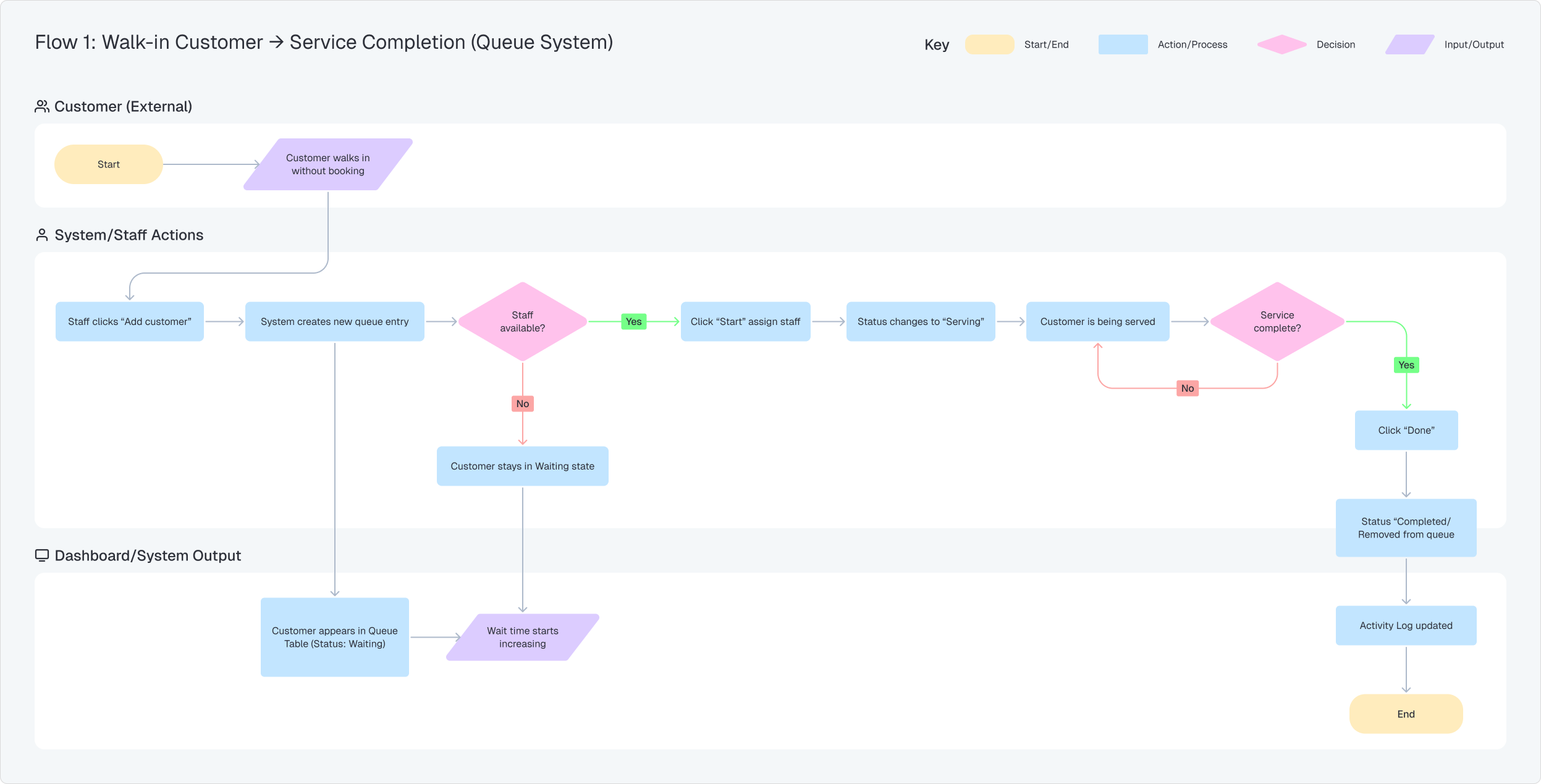
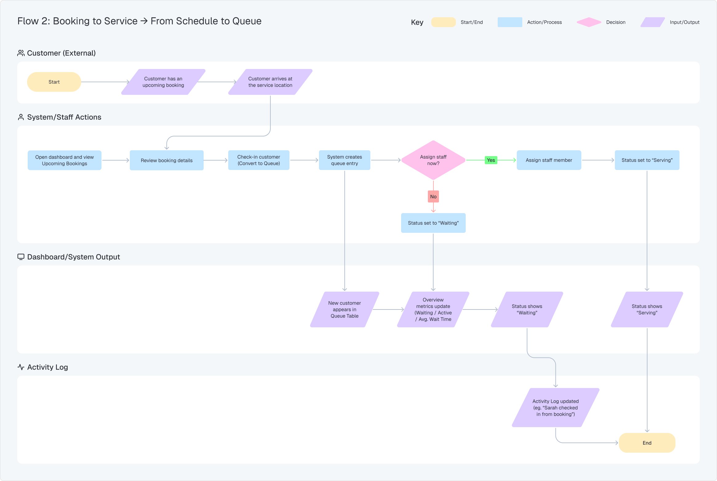
By mapping these user flows, we can understand how staff navigate the system and ensure it supports real time service needs.
For Linea, this defines a clear path from customer arrival or booking check in to service completion, unifying walk ins and scheduled bookings into one seamless workflow.
Design System Foundations
Structured visual system including color, typography, spacing, and grid to ensure consistency and scalability.
Typography
Heading 1
Heading 2
Heading 3
Heading 4
Heading 5
Heading 6
Body - 16px
The quick, brown fox jumps over a lazy dog. DJs flock by when MTV ax quiz prog. Junk MTV quiz graced by fox whelps. Bawds jog, flick quartz, vex nymphs. Waltz, bad nymph, for quick jigs vex! Fox nymphs grab quick-jived waltz.
Body - 14px
The quick, brown fox jumps over a lazy dog. DJs flock by when MTV ax quiz prog. Junk MTV quiz graced by fox whelps. Bawds jog, flick quartz, vex nymphs. Waltz, bad nymph, for quick jigs vex! Fox nymphs grab quick-jived waltz.
Blockquotes
“The quick, brown fox jumps over a lazy dog.”
Small
This is a very small text.
Buttons
XlargeLargeMediumSmall
Spacing
Spacing scale to maintain visual hierarchy, consistency, and alignment across interfaces.
Heading
This is a brief description of the card. It can be a maximum of 2-3 lines.
12px12px12px24px16px24px12px
4px
8px
12px
16px
24px
32px
40px
48px
56px
64px
Grid
Structured grid system to support consistent layouts across complex interfaces.
12 Columns - StretchMargins 64px
Component Library
Reusable components designed for consistency and scalable product development.
This is a short support text to add a description of the card.
Filled
Heading
This is a short support text to add a description of the card.
Outlined
Heading
This is a short support text to add a description of the card.
Badges
Small
1Single
246Large
124
Chips
LabelDefault
LabelHover
LabelSelected
LabelPressed
LabelDrag
LabelDisabled
Component Behavior
Interact with components to explore states and behaviors
Progress & Feedback
Circular type
Linear type
Controls
Checkbox
Slider
Switch
Dot navigation
Disclosure
Accordion
How do I update my profile information?
To update your profile information, navigate to the Profile or Account Settings section from the main menu. Click the Edit Profile button, where fields such as name, email address, password, and preferences can be modified. Make the desired changes, then select Save Changes to apply the updates. If verification is required, follow the on-screen instructions to confirm your information before exiting the page.
Dashboard Structure (Wireframe)
Low-fidelity dashboard structure defining information hierarchy for queue, booking, and multi-location workflows.
Focused on clarity and usability in a complex SaaS environment.












 1
1 24
24 Label
Label
 Label
Label
 Label
Label